Build bold. Launch fast.
Custom Section
Used to group and style large sections of a page.
This is a Heading inside a Custom Section.
---
import Heading from "@core-elements/heading/Heading.astro";
import CustomSection from "@builders/custom-section/CustomSection.astro";
---

<CustomSection backgroundColor="surface" backgroundImage={{"source":"","alt":"","positionVertical":"top","positionHorizontal":"center"}} colorScheme="inherit" label="" maxContentWidth="2xl" paddingHorizontal="md" paddingVertical="md">
  <Heading level="h2">
    This is a Heading inside a Custom Section.
  </Heading>
</CustomSection>
---
blocks:
_component: page-sections/builders/custom-section
backgroundColor: surface
paddingHorizontal: md
paddingVertical: md
contentSections:
- _component: building-blocks/core-elements/heading
text: This is a Heading inside a Custom Section.
level: h2
label: ''
maxContentWidth: 2xl
colorScheme: inherit
backgroundImage:
source: ''
alt: ''
positionVertical: top
positionHorizontal: center
rounded: false
---Overview
Defines the primary sections of a page and manages their appearance. Controls background, padding, and overall page width to keep layouts consistent.
Properties
label string
contentSections string | default: array
maxContentWidth string | default: 2xl
paddingHorizontal string | default: md
paddingVertical string | default: md
colorScheme string | default: inherit
backgroundColor string | default: base
backgroundImage string | default: object
rounded string | default: false
useDefaultEditableBinding string | default: true
Slots
default
The contents of the Custom Section.
Used only when the contentSections property is not set.
Examples
Background color
Accent background color
---
import Heading from "@core-elements/heading/Heading.astro";
import CustomSection from "@builders/custom-section/CustomSection.astro";
---

<CustomSection backgroundColor="accent" paddingHorizontal="lg" paddingVertical="lg">
  <Heading level="h2">
    Accent background color
  </Heading>
</CustomSection>
---
blocks:
_component: page-sections/builders/custom-section
backgroundColor: accent
paddingVertical: lg
paddingHorizontal: lg
contentSections:
- _component: building-blocks/core-elements/heading
text: Accent background color
level: h2
---Highlight background color
---
import Heading from "@core-elements/heading/Heading.astro";
import CustomSection from "@builders/custom-section/CustomSection.astro";
---

<CustomSection backgroundColor="highlight" paddingHorizontal="lg" paddingVertical="lg">
  <Heading level="h2">
    Highlight background color
  </Heading>
</CustomSection>
---
blocks:
_component: page-sections/builders/custom-section
backgroundColor: highlight
paddingVertical: lg
paddingHorizontal: lg
contentSections:
- _component: building-blocks/core-elements/heading
text: Highlight background color
level: h2
---Surface background color
---
import Heading from "@core-elements/heading/Heading.astro";
import CustomSection from "@builders/custom-section/CustomSection.astro";
---

<CustomSection backgroundColor="surface" paddingHorizontal="lg" paddingVertical="lg">
  <Heading level="h2">
    Surface background color
  </Heading>
</CustomSection>
---
blocks:
_component: page-sections/builders/custom-section
backgroundColor: surface
paddingVertical: lg
paddingHorizontal: lg
contentSections:
- _component: building-blocks/core-elements/heading
text: Surface background color
level: h2
---Base background color (page background color)
---
import Heading from "@core-elements/heading/Heading.astro";
import CustomSection from "@builders/custom-section/CustomSection.astro";
---

<CustomSection backgroundColor="base" paddingHorizontal="lg" paddingVertical="lg">
  <Heading level="h2">
    Base background color (page background color)
  </Heading>
</CustomSection>
---
blocks:
_component: page-sections/builders/custom-section
backgroundColor: base
paddingVertical: lg
paddingHorizontal: lg
contentSections:
- _component: building-blocks/core-elements/heading
text: Base background color (page background color)
level: h2
---No background color (transparent)
---
import Heading from "@core-elements/heading/Heading.astro";
import CustomSection from "@builders/custom-section/CustomSection.astro";
---

<CustomSection backgroundColor="base" paddingHorizontal="lg" paddingVertical="lg">
  <Heading level="h2">
    No background color (transparent)
  </Heading>
</CustomSection>
---
blocks:
_component: page-sections/builders/custom-section
backgroundColor: base
paddingVertical: lg
paddingHorizontal: lg
contentSections:
- _component: building-blocks/core-elements/heading
text: No background color (transparent)
level: h2
---Background image
---
import Text from "@core-elements/text/Text.astro";
import CustomSection from "@builders/custom-section/CustomSection.astro";
---
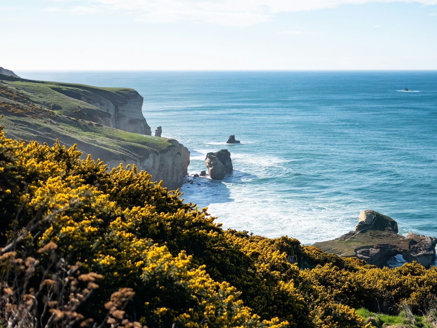
<CustomSection backgroundImage={{"source":"/src/assets/images/component-docs/dunedin-cliff.jpg","alt":"Dunedin cliffside","positionVertical":"top","positionHorizontal":"left"}} paddingHorizontal="md" paddingVertical="2xl">
<Text alignX="end">
<p>Build bold. Launch fast.</p>
</Text>
</CustomSection>---
blocks:
_component: page-sections/builders/custom-section
paddingVertical: 2xl
paddingHorizontal: md
backgroundImage:
source: /src/assets/images/component-docs/dunedin-cliff.jpg
alt: Dunedin cliffside
positionVertical: top
positionHorizontal: left
contentSections:
- _component: building-blocks/core-elements/text
alignX: end
text: Build bold. Launch fast.
---Build bold. Launch fast.
---
import Text from "@core-elements/text/Text.astro";
import CustomSection from "@builders/custom-section/CustomSection.astro";
---

<CustomSection backgroundImage={{"source":"/src/assets/images/component-docs/dunedin-cliff.jpg","alt":"Dunedin cliffside","positionVertical":"center","positionHorizontal":"center"}} paddingHorizontal="md" paddingVertical="2xl">
  <Text alignX="end">
    <p>Build bold. Launch fast.</p>
  </Text>
</CustomSection>
---
blocks:
_component: page-sections/builders/custom-section
paddingVertical: 2xl
paddingHorizontal: md
backgroundImage:
source: /src/assets/images/component-docs/dunedin-cliff.jpg
alt: Dunedin cliffside
positionVertical: center
positionHorizontal: center
contentSections:
- _component: building-blocks/core-elements/text
alignX: end
text: Build bold. Launch fast.
---Build bold. Launch fast.
---
import Text from "@core-elements/text/Text.astro";
import CustomSection from "@builders/custom-section/CustomSection.astro";
---

<CustomSection backgroundImage={{"source":"/src/assets/images/component-docs/dunedin-cliff.jpg","alt":"Dunedin cliffside","positionVertical":"bottom","positionHorizontal":"right"}} paddingHorizontal="md" paddingVertical="2xl">
  <Text alignX="end">
    <p>Build bold. Launch fast.</p>
  </Text>
</CustomSection>
---
blocks:
_component: page-sections/builders/custom-section
paddingVertical: 2xl
paddingHorizontal: md
backgroundImage:
source: /src/assets/images/component-docs/dunedin-cliff.jpg
alt: Dunedin cliffside
positionVertical: bottom
positionHorizontal: right
contentSections:
- _component: building-blocks/core-elements/text
alignX: end
text: Build bold. Launch fast.
---Max Width
This Custom Section has xs max content width.
---
import Heading from "@core-elements/heading/Heading.astro";
import CustomSection from "@builders/custom-section/CustomSection.astro";
---

<CustomSection backgroundColor="surface" maxContentWidth="xs">
  <Heading alignX="center" level="h2">
    This Custom Section has xs max content width.
  </Heading>
</CustomSection>
---
blocks:
_component: page-sections/builders/custom-section
backgroundColor: surface
maxContentWidth: xs
contentSections:
- _component: building-blocks/core-elements/heading
text: This Custom Section has xs max content width.
level: h2
alignX: center
---This Custom Section has sm max content width.
---
import Heading from "@core-elements/heading/Heading.astro";
import CustomSection from "@builders/custom-section/CustomSection.astro";
---

<CustomSection backgroundColor="surface" maxContentWidth="sm">
  <Heading alignX="center" level="h2">
    This Custom Section has sm max content width.
  </Heading>
</CustomSection>
---
blocks:
_component: page-sections/builders/custom-section
backgroundColor: surface
maxContentWidth: sm
contentSections:
- _component: building-blocks/core-elements/heading
text: This Custom Section has sm max content width.
level: h2
alignX: center
---This Custom Section has md max content width.
---
import Heading from "@core-elements/heading/Heading.astro";
import CustomSection from "@builders/custom-section/CustomSection.astro";
---

<CustomSection backgroundColor="surface" maxContentWidth="md">
  <Heading alignX="center" level="h2">
    This Custom Section has md max content width.
  </Heading>
</CustomSection>
---
blocks:
_component: page-sections/builders/custom-section
backgroundColor: surface
maxContentWidth: md
contentSections:
- _component: building-blocks/core-elements/heading
text: This Custom Section has md max content width.
level: h2
alignX: center
---This Custom Section has lg max content width.
---
import Heading from "@core-elements/heading/Heading.astro";
import CustomSection from "@builders/custom-section/CustomSection.astro";
---

<CustomSection backgroundColor="surface" maxContentWidth="lg">
  <Heading alignX="center" level="h2">
    This Custom Section has lg max content width.
  </Heading>
</CustomSection>
---
blocks:
_component: page-sections/builders/custom-section
backgroundColor: surface
maxContentWidth: lg
contentSections:
- _component: building-blocks/core-elements/heading
text: This Custom Section has lg max content width.
level: h2
alignX: center
---This Custom Section has xl max content width.
---
import Heading from "@core-elements/heading/Heading.astro";
import CustomSection from "@builders/custom-section/CustomSection.astro";
---

<CustomSection backgroundColor="surface" maxContentWidth="xl">
  <Heading alignX="center" level="h2">
    This Custom Section has xl max content width.
  </Heading>
</CustomSection>
---
blocks:
_component: page-sections/builders/custom-section
backgroundColor: surface
maxContentWidth: xl
contentSections:
- _component: building-blocks/core-elements/heading
text: This Custom Section has xl max content width.
level: h2
alignX: center
---This Custom Section has 2xl max content width.
---
import Heading from "@core-elements/heading/Heading.astro";
import CustomSection from "@builders/custom-section/CustomSection.astro";
---

<CustomSection backgroundColor="surface" maxContentWidth="2xl">
  <Heading alignX="center" level="h2">
    This Custom Section has 2xl max content width.
  </Heading>
</CustomSection>
---
blocks:
_component: page-sections/builders/custom-section
backgroundColor: surface
maxContentWidth: 2xl
contentSections:
- _component: building-blocks/core-elements/heading
text: This Custom Section has 2xl max content width.
level: h2
alignX: center
---This Custom Section has 3xl max content width.
---
import Heading from "@core-elements/heading/Heading.astro";
import CustomSection from "@builders/custom-section/CustomSection.astro";
---

<CustomSection backgroundColor="surface" maxContentWidth="3xl">
  <Heading alignX="center" level="h2">
    This Custom Section has 3xl max content width.
  </Heading>
</CustomSection>
---
blocks:
_component: page-sections/builders/custom-section
backgroundColor: surface
maxContentWidth: 3xl
contentSections:
- _component: building-blocks/core-elements/heading
text: This Custom Section has 3xl max content width.
level: h2
alignX: center
---Padding
This Custom Section has xs padding.
---
import Heading from "@core-elements/heading/Heading.astro";
import CustomSection from "@builders/custom-section/CustomSection.astro";
---

<CustomSection backgroundColor="surface" paddingHorizontal="xs" paddingVertical="xs">
  <Heading level="h2">
    This Custom Section has xs padding.
  </Heading>
</CustomSection>
---
blocks:
_component: page-sections/builders/custom-section
backgroundColor: surface
paddingHorizontal: xs
paddingVertical: xs
contentSections:
- _component: building-blocks/core-elements/heading
text: This Custom Section has xs padding.
level: h2
---This Custom Section has sm padding.
---
import Heading from "@core-elements/heading/Heading.astro";
import CustomSection from "@builders/custom-section/CustomSection.astro";
---

<CustomSection backgroundColor="surface" paddingHorizontal="sm" paddingVertical="sm">
  <Heading level="h2">
    This Custom Section has sm padding.
  </Heading>
</CustomSection>
---
blocks:
_component: page-sections/builders/custom-section
backgroundColor: surface
paddingHorizontal: sm
paddingVertical: sm
contentSections:
- _component: building-blocks/core-elements/heading
text: This Custom Section has sm padding.
level: h2
---This Custom Section has md padding.
---
import Heading from "@core-elements/heading/Heading.astro";
import CustomSection from "@builders/custom-section/CustomSection.astro";
---

<CustomSection backgroundColor="surface" paddingHorizontal="md" paddingVertical="md">
  <Heading level="h2">
    This Custom Section has md padding.
  </Heading>
</CustomSection>
---
blocks:
_component: page-sections/builders/custom-section
backgroundColor: surface
paddingHorizontal: md
paddingVertical: md
contentSections:
- _component: building-blocks/core-elements/heading
text: This Custom Section has md padding.
level: h2
---This Custom Section has lg padding.
---
import Heading from "@core-elements/heading/Heading.astro";
import CustomSection from "@builders/custom-section/CustomSection.astro";
---

<CustomSection backgroundColor="surface" paddingHorizontal="lg" paddingVertical="lg">
  <Heading level="h2">
    This Custom Section has lg padding.
  </Heading>
</CustomSection>
---
blocks:
_component: page-sections/builders/custom-section
backgroundColor: surface
paddingHorizontal: lg
paddingVertical: lg
contentSections:
- _component: building-blocks/core-elements/heading
text: This Custom Section has lg padding.
level: h2
---This Custom Section has 2xl padding.
---
import Heading from "@core-elements/heading/Heading.astro";
import CustomSection from "@builders/custom-section/CustomSection.astro";
---

<CustomSection backgroundColor="surface" paddingHorizontal="2xl" paddingVertical="2xl">
  <Heading level="h2">
    This Custom Section has 2xl padding.
  </Heading>
</CustomSection>
---
blocks:
_component: page-sections/builders/custom-section
backgroundColor: surface
paddingHorizontal: 2xl
paddingVertical: 2xl
contentSections:
- _component: building-blocks/core-elements/heading
text: This Custom Section has 2xl padding.
level: h2
---This Custom Section has 3xl padding.
---
import Heading from "@core-elements/heading/Heading.astro";
import CustomSection from "@builders/custom-section/CustomSection.astro";
---

<CustomSection backgroundColor="surface" paddingHorizontal="3xl" paddingVertical="3xl">
  <Heading level="h2">
    This Custom Section has 3xl padding.
  </Heading>
</CustomSection>
---
blocks:
_component: page-sections/builders/custom-section
backgroundColor: surface
paddingHorizontal: 3xl
paddingVertical: 3xl
contentSections:
- _component: building-blocks/core-elements/heading
text: This Custom Section has 3xl padding.
level: h2
---Color Scheme
This heading and Custom Section have a dark color scheme.
---
import Heading from "@core-elements/heading/Heading.astro";
import CustomSection from "@builders/custom-section/CustomSection.astro";
---

<CustomSection backgroundColor="surface" colorScheme="dark" paddingHorizontal="md" paddingVertical="md">
  <Heading level="h2">
    This heading and Custom Section have a dark color scheme.
  </Heading>
</CustomSection>
---
blocks:
_component: page-sections/builders/custom-section
backgroundColor: surface
paddingHorizontal: md
paddingVertical: md
colorScheme: dark
contentSections:
- _component: building-blocks/core-elements/heading
text: This heading and Custom Section have a dark color scheme.
level: h2
---This heading and Custom Section have a default color scheme.
---
import Heading from "@core-elements/heading/Heading.astro";
import CustomSection from "@builders/custom-section/CustomSection.astro";
---

<CustomSection backgroundColor="surface" paddingHorizontal="md" paddingVertical="md">
  <Heading level="h2">
    This heading and Custom Section have a default color scheme.
  </Heading>
</CustomSection>
---
blocks:
_component: page-sections/builders/custom-section
backgroundColor: surface
paddingHorizontal: md
paddingVertical: md
contentSections:
- _component: building-blocks/core-elements/heading
text: This heading and Custom Section have a default color scheme.
level: h2
---Rounded Corners
Rounded Custom Section
This Custom Section has rounded corners applied.
---
import Heading from "@core-elements/heading/Heading.astro";
import Text from "@core-elements/text/Text.astro";
import CustomSection from "@builders/custom-section/CustomSection.astro";
---

<CustomSection backgroundColor="surface" paddingHorizontal="md" paddingVertical="md" rounded>
  <Heading level="h3">
    Rounded Custom Section
  </Heading>
  <Text>
    <p>This Custom Section has rounded corners applied.</p>
  </Text>
</CustomSection>
---
blocks:
_component: page-sections/builders/custom-section
backgroundColor: surface
rounded: true
paddingHorizontal: md
paddingVertical: md
contentSections:
- _component: building-blocks/core-elements/heading
text: Rounded Custom Section
level: h3
- _component: building-blocks/core-elements/text
text: This Custom Section has rounded corners applied.
---Square Custom Section
This Custom Section has square corners (rounded disabled).
---
import Heading from "@core-elements/heading/Heading.astro";
import Text from "@core-elements/text/Text.astro";
import CustomSection from "@builders/custom-section/CustomSection.astro";
---

<CustomSection backgroundColor="surface" paddingHorizontal="md" paddingVertical="md">
  <Heading level="h3">
    Square Custom Section
  </Heading>
  <Text>
    <p>This Custom Section has square corners (rounded disabled).</p>
  </Text>
</CustomSection>
---
blocks:
_component: page-sections/builders/custom-section
backgroundColor: surface
rounded: false
paddingHorizontal: md
paddingVertical: md
contentSections:
- _component: building-blocks/core-elements/heading
text: Square Custom Section
level: h3
- _component: building-blocks/core-elements/text
text: This Custom Section has square corners (rounded disabled).
---